Giving the tutoring website Click a facelift and building out a parent portal
Click Learning Co
Timeline
January 25 - February 25 (4 weeks)
My Role
UX Designer and UX Writer
What is Click Learning Co?
Click Learning is a tutor matching service that will find you an educator based on your child’s interests. Click’s values are “teaching the whole person” by appealing to their interests, making their education more relatable.

PROBLEM
When we were tasked with redesigning the Click Learning website, the first thing we did was look at the existing website. While the website initially appeared great, upon further review we saw major problems.
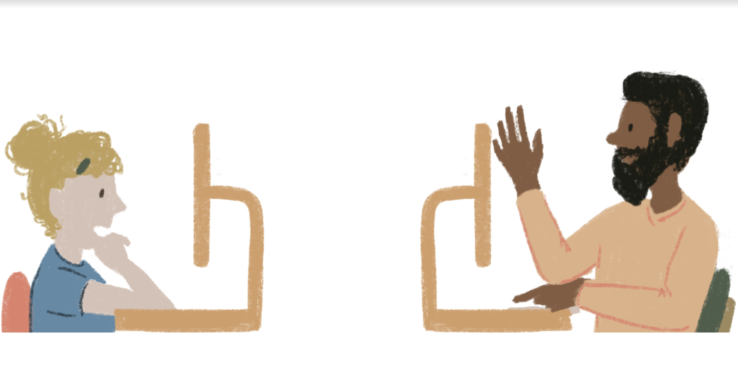
Parents need to be able to efficiently get the most suitable academic help and easily stay involved in their kids’ learning, because they’re busy and find Click Learning Co.’s platform currently does not completely support their busy schedule.
RESEARCH
We followed a process of research, ideation, design, outcome and our presentation will present that information in that order.
We used things such as Comparative analysis, user interviews, and affinity mapping for our research.

COMPETITIVE ANALYSIS
Using comparative analysis, we compared Click Learning with their direct competition. As you can see, the competition fulfilled two things that Click Learning did not. Click did not offer any way to message a tutor or filter a tutor.
However, what set Click Learning apart from our competitors was the Matching aspect of Click Learning.

HEURISTIC EVALUATION
To better display the unique features of click, we did a Heuristic examination of Clicks current website where we looked at core design principles and how they match up against common design practices.
The major issue we experienced was that Click Learning had most of their information hidden behind log-in screens, this prevented new users from being able to understand what exactly click learning did.

INTERVIEWS
We conducted interviews through video calls. During the interviews, we asked parents questions regarding their experiences with having their children get supplemental learning through online tutoring.

INTERVIEW INSIGHTS
Here are some direct quotes from our interviewees

AFFINITY MAPPING
We then transferred our observations and insights onto stickie notes. As a team, we grouped these notes into different categories. The goal here is to identify if there are any trends in the users’ pain points and needs
After the grouping, we discovered certain trends

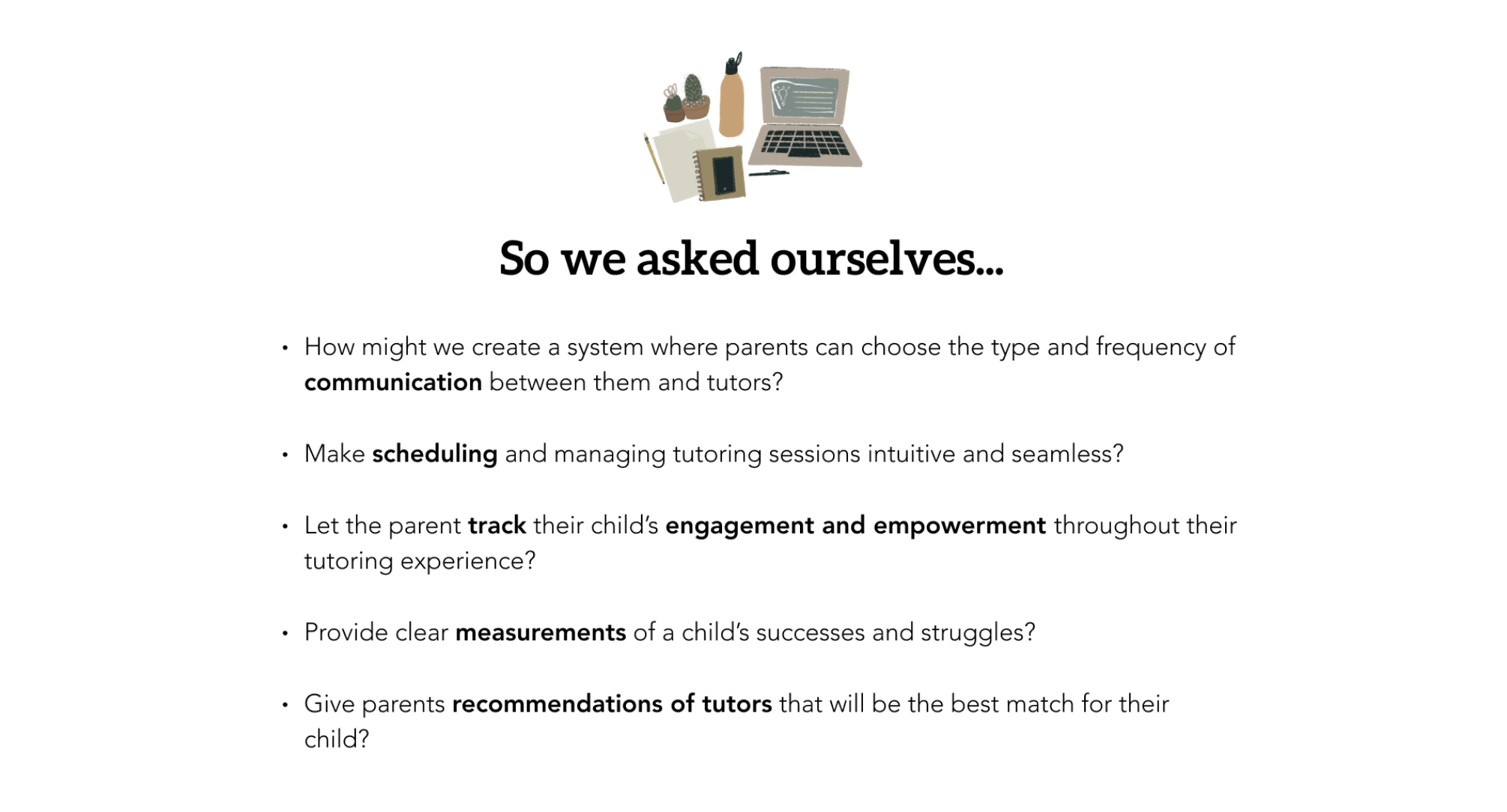
HMW STATEMENTS
PERSONA
Nicole is a mother of 2, looking for a tutor that she can trust to help her son and daughter with their supplemental learning. She’s tried an online education platform in the past and knows she needs to be able to track Emily’s progress and communicate with her tutors about her child’s successes and struggles.
Nicole is frustrated when she has a hard time finding the right tutor for her children, when the tutoring sessions don’t accommodate to her schedule and when there’s no metrics for her to gauge whether tutoring is working successfully or not.

SOLUTION STATEMENT
After learning some of the reasons behind why Click Learning’s website wasn’t currently working for parents, we soon knew we had defined our solution and could begin ideating design.

DESIGN
After these considerations were made, we decided to do an Ideation Workshop. This is a brainstorming exercise that helps take rough draft mockups and identify common themes to help unify the group on the direction of our design layouts

STYLE GUIDE
This is the typography, color palette, iconography, and other design elements that contribute to the overall look and feel of the final digital product
This ensures that no matter where our users go on the website, they will have a consistent experience

LO-FI DESIGN
As previously mentioned the existing site hosted too much content per page, creating cognitive overload for users. To address this, we decided to slim down how much information each page hosted and implemented clearly marked call-to-action buttons.
These tools would help users navigate the website without becoming too overwhelmed, lost, or confused.

LO-FI DESIGN
Next we wanted to allow users to see some top-level service information, to help provide an understanding of what the brand offers and increase their confidence pre-sign up
With the additional context and peace of mind given to our users, we view this component as a potential incentive to encourage more users to sign up
LO-FI DESIGN
We know how important it is to connect a child with an educator who understands their hobbies, interests, learning style, and educational needs. That's why we prompt our users to answer seven questions that will help us find the best educator for their child.
We also understand that time is valuable. That's why we've included a Progress bar feature that allows users to see how long onboarding might take, so they can plan accordingly. For many parents scheduling can be a challenge. To make it easier, we give users the option to provide their availability upfront, which helps us connect them with an educator that fits their schedule.

LO-FI DESIGN
Here you can see Parent Dashboard
In the main navigation bar parents can access multiple Learner profiles, Educators, Booking, Messaging, and their Wallet at a glance. Additionally, parents can view educator recommendations along with the match percentage, making it even easier to find the perfect educator for their child

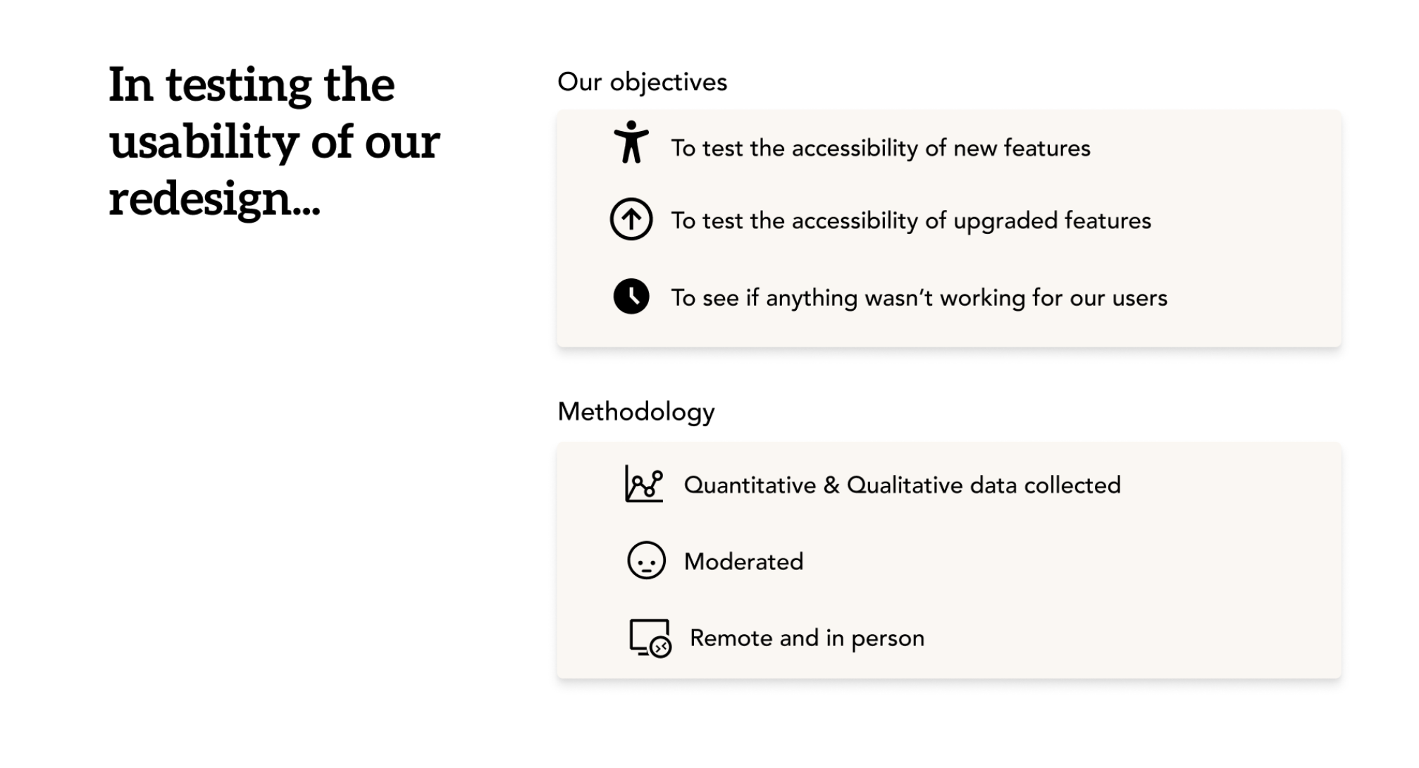
TESTING
We tested out our prototype with different people that are all parents of school-aged or younger children. It was our goal to see how accessible the new and upgraded features were, and also to see if anything wasn’t working for our users.
We collected qualitative and quantitative data and we moderated the tests which were conducted remotely and in person
METRICS
We asked our participants to explore the Click Learning site to learn more about our values, discover what sessions Click offers, and then once they felt familiar with the site, we asked them to sign up for Click’s service as a first time parent/guardian
Most of the users immediately clicked on enroll or “Our services” or “Our tutors” and didn’t really explore the website. Some of them also seemed a little unsure about the context of the onboarding questions and they didn’t know why those questions were being asked until they got all the way to the portal, where it was made clear that we were using that data to match them with a tutor.

Our users seemed to navigate the site easily, but we worried that there could be uncertainty for users about Click’s main goal of connecting Learners and Educators
We knew we could make Click Learning Co.’s values more clear for users like Nicole, so we continued to iterate and make improvements
HI-FI DESIGN
On our final iteration of the homepage, we moved the “Learn more” CTA to the top of the page to give it more hierarchy. We also used light blue blocks to help break up the page. The global navigation at the top of the page was updated to highlight while in a hover state to signify to users these options were clickable

HI-FI DESIGN
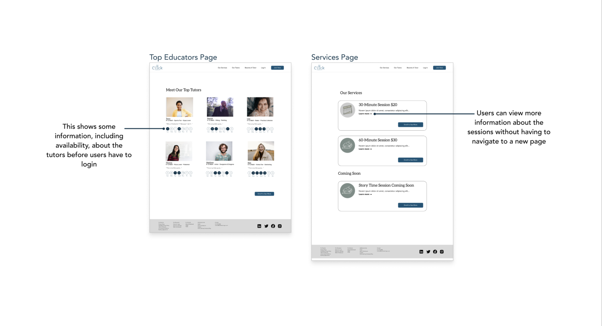
Next on our Services page, we continued improving this design by highlighting the option to signify to users which page they were currently viewing. In addition, we shifted our CTA for each service to a single CTA to reduce the noise of this display

HI-FI DESIGN
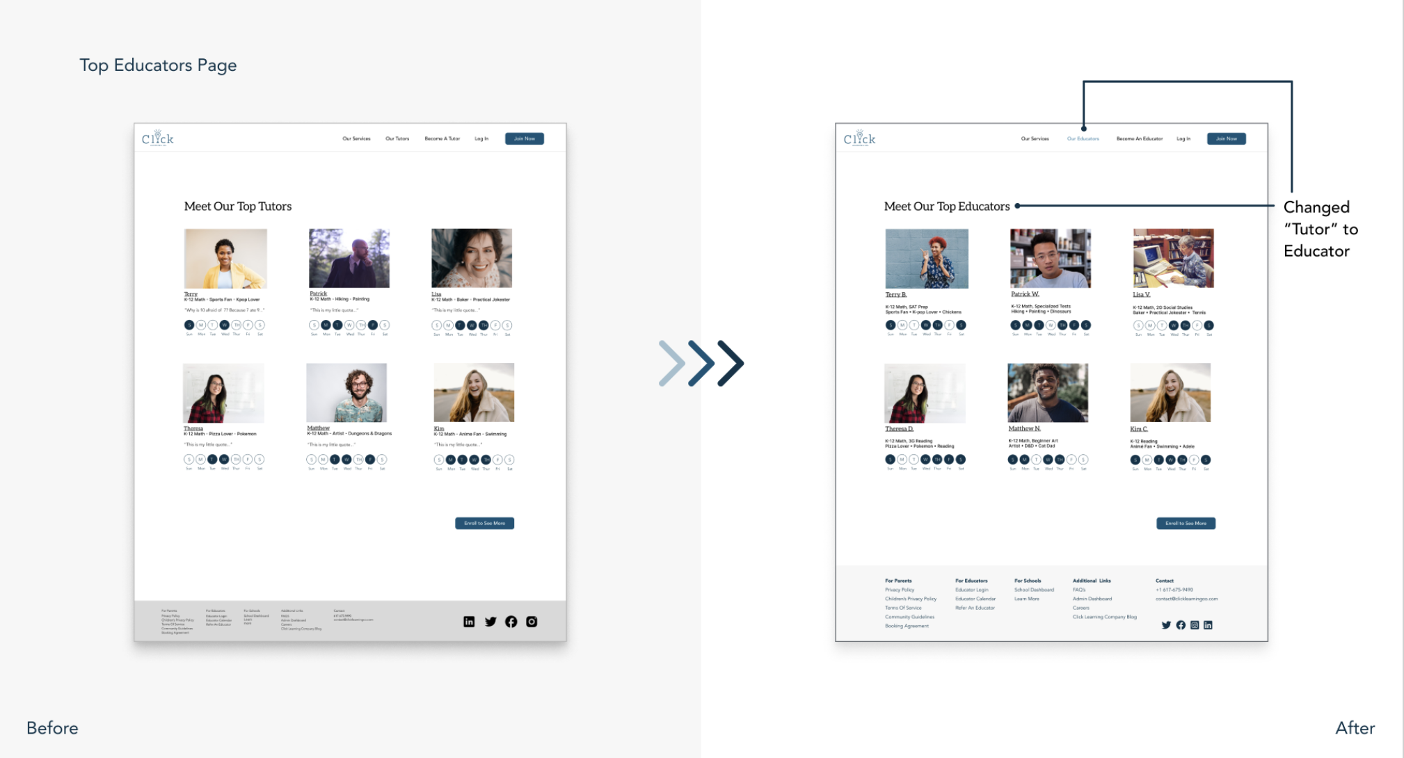
On our Tutor page, we removed the quotes associated with each tutor to minimize the amount of upkeep needed for this display. We also changed the language from “tutor” to “educator” after learning that there may be stigmas associated with the word “tutor”, in addition to “child” to “learner”.
HI-FI DESIGN
On the onboarding screens where parents answer questions about their child, we added “We match Learners with Educators they best connect with”, so users would know why we were were collecting this data
We also added a skip button so users can skip that step of onboarding and resume at a later time. Additionally, rather than having to enter their child’s full birthday, users can now enter just the month and year, for added security. Finally, users now know they can select all that apply when answering these questions to give them more confidence in selecting multiple options

HI-FI DESIGN
There wasn’t a lot that changed within the parent portal, but we fleshed out the Messaging, Booking and Wallet tool within the dashboard

FINAL PROTOTYPE

LESSON