NWS
Redesigning a government website like The National Weather Service
Timeline
December 17, 2022 - January 17, 2023
(4 weeks)


My Role
Group project for General Assembly UX Bootcamp
Meet the team
Four of us were assigned to work on this project and it helped that we were already friendly outside of class. That made for a fun and collaborative work dynamic and it shows in our combined efforts!

Chelsea von Kaenel
Karishma Shetty
Cindy Chan
Juliette Marini


PROBLEM
NWS’ site was overwhelming and failed to make emergency plans and alerts obvious
As a person who lives in a fire and earthquake zone, I check weather websites and apps pretty frequently. Yet, a lot of weather sites lack an alert system or had easy navigation to find emergency plans or emergency kit checklists. This led us to ask why don’t everyday users look to a government site like the National Weather Service for emergency alerts or everyday forecasts?


Extended Forecast
We added a button to see more forecast info
Emergency Kit
We made a downloadable emergency PDF page


Homepage
We added a location search bar, an easy view forecast, and an interactive map
SOLUTION
RESEARCH
We interviewed different users (ages 25-45) from all over the U.S. that lived in extreme weather conditions
It all begins with research to design a solution: we conducted user interviews, created a site map and affinity map, did some competitive analysis, and did secondary research.
We asked users how they decide what source to check when checking weather, about a time they’ve experienced a big weather event, how they decide what to do in an emergency situation, and about their experience navigating government websites.
The competition has more user-friendly features than NWS does
National Weather Service lacked most of the features the other weather websites offered
COMPETITIVE ANALYSIS

This led us to ask…
How might we give the user local and accurate information of the weather?
How might we make evacuation plans easily accessible for a user?
How might we make alerts obvious to the user?
KEY INSIGHT
Users need to be able to quickly access both local and non-local weather information so they can be best prepared to plan their day in advance for emergency or non-emergency situations

PERSONA
Steve
67, Married, Retired
Weather Expert
Family Man
Early Bird
“I need a factual site to show us a projected path, with options to take uncertainty into account.”
Uses: his tablet to check weather websites
About: Steve lives in a hurricane zone and wants to ensure he has an evacuation plan in place because his wife has chronic pain
Pain Points
when the media overhypes the weather conditions
when there’s too much technical jargon that’s difficult to share with others
Needs and Goals
simple and accurate emergency updates in real-time
emergency weather alerts
road conditions
danger meter
Due to time constraints, our team took user/instructor feedback, research/secondary research, heuristics, and intuition to create a proto-persona that would represent a typical user of the NWS. This proto-persona normally checks the NWS for accurate information on big weather occurrences. Meet Steve!
We started with a sketching workshop and chose the features we liked, made sense for the persona Steve, and wanted to keep
DESIGN

LO-FIDELITY ITERATIONS

We split up the pages to design and then collaborated to finalize this second iteration of wireframes
STYLE GUIDE

We chose to stick with the NWS color palette and added the red for the alert bar and agreed on which assets we liked, the typography we liked, and the layout grid we wanted to use for the final product.
TESTING & IMPROVEMENTS
Based on feedback from usability testing and instructor feedback, we continually iterated our designs


FINAL SCREENS


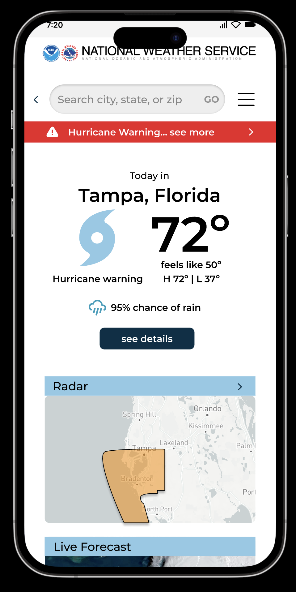


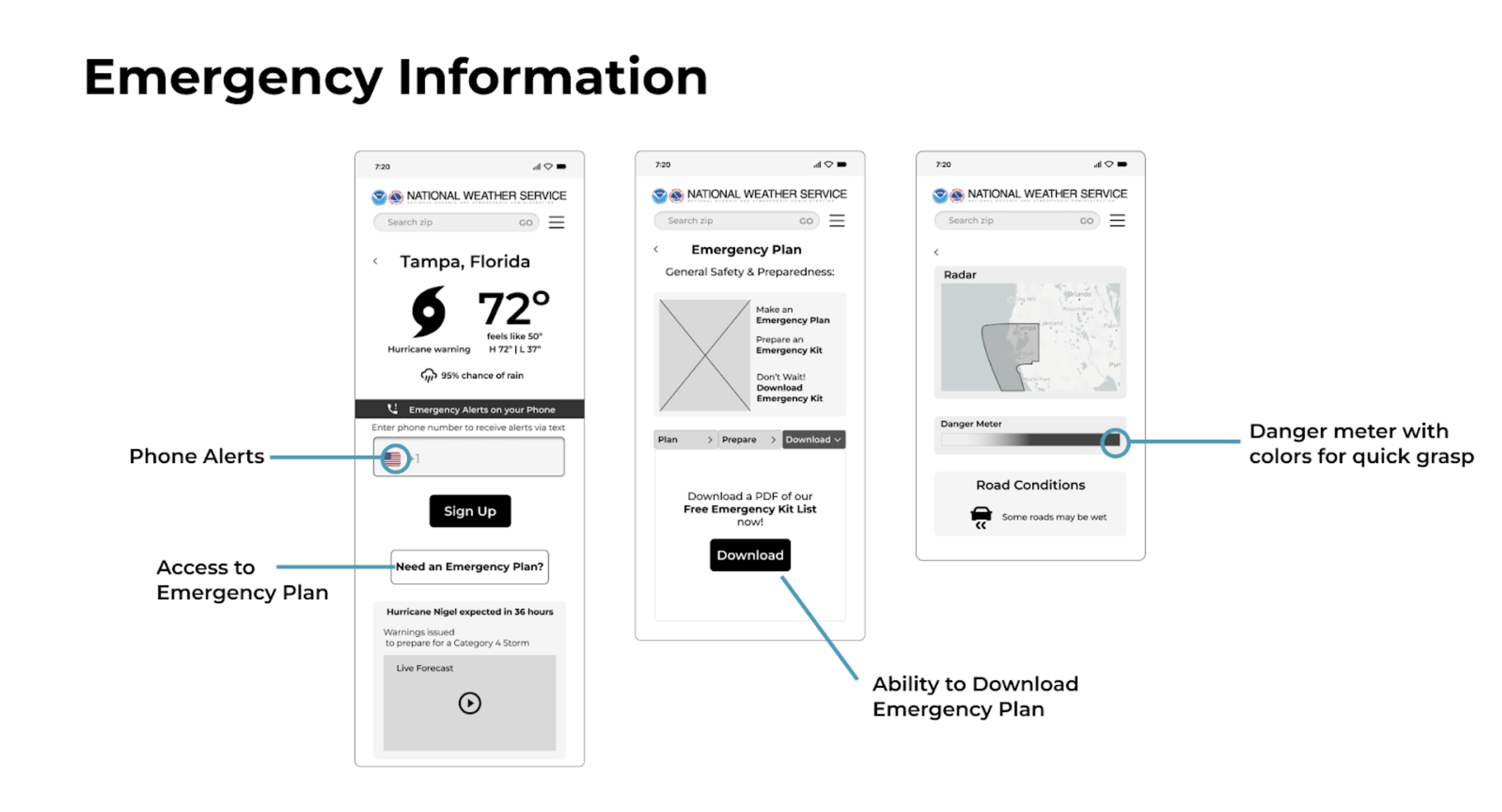
Our team designed a call to action bar to alert users of upcoming big weather occurrences at the top of screen, a modal window to register a user’s phone number for emergency alerts, and a downloadable emergency kit checklist to be prepared and pack survival items ahead of time
This screen shows the radar map of the location the hurricane is most likely to affect
The Tampa, Florida forecast page includes the alert bar, current temp, an hourly forecast button, and additional info
This screen allows the user to sign up for emergency phone alerts, contains an emergency plan button, and additional hurricane info
This screen confirms the phone number was added to the database for confirmation
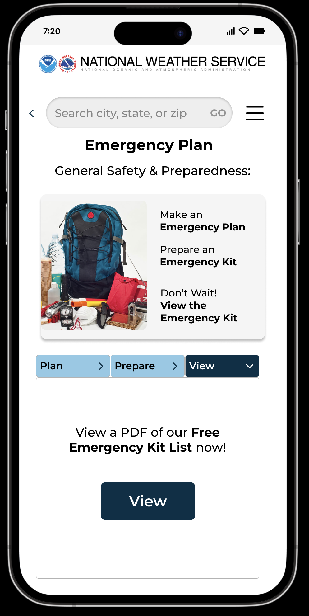
The page shows what you need to do in case of an emergency and has a button to view the emergency kit
The emergency preparedness kit page allows for the user to take a screenshot or download it onto their phone or a file
FINAL PROTOTYPE
CONCLUSION/LESSON

What I learned from redesigning a government website is most of them have redundant and an overabundance of information that is very confusing to users. The design needs to be simplified and the information architecture needs to be easier to understand as well.
In addition, the NWS project is such a massive undertaking that I don’t think I would have been able to accomplish, had it not been for a team effort. What helped us design a great product is we have cohesive working styles, a friendly dynamic, and are all hard workers. I took away from this project a lifelong support network and hopefully future coworkers!